library(reshape2)
library(dplyr)
##
## Attaching package: 'dplyr'
## The following objects are masked from 'package:stats':
##
##     filter, lag
## The following objects are masked from 'package:base':
##
##     intersect, setdiff, setequal, union
##
## Attaching package: 'igraph'
## The following objects are masked from 'package:dplyr':
##
##     as_data_frame, groups, union
## The following objects are masked from 'package:stats':
##
##     decompose, spectrum
## The following object is masked from 'package:base':
##
##     union
##
## Attaching package: 'tidyr'
## The following object is masked from 'package:igraph':
##
##     crossing
## The following object is masked from 'package:reshape2':
##
##     smiths
library(DT)
library(pheatmap)
library(ggraph)
## Loading required package: ggplot2
## Warning: package 'ggplot2' was built under R version 4.5.2
library(ggplot2)
library(ggrepel)
library(tidygraph)
##
## Attaching package: 'tidygraph'
## The following object is masked from 'package:igraph':
##
##     groups
## The following object is masked from 'package:stats':
##
##     filter
##
## Attaching package: 'gplots'
## The following object is masked from 'package:stats':
##
##     lowess
library("ggplot2")
library(reshape2)
library(RColorBrewer)
library(dplyr)
library(viridis)
## Loading required package: viridisLite
library(ggrepel)
library(corrplot)
##
## Attaching package: 'plotly'
## The following object is masked from 'package:ggplot2':
##
##     last_plot
## The following object is masked from 'package:igraph':
##
##     groups
## The following object is masked from 'package:stats':
##
##     filter
## The following object is masked from 'package:graphics':
##
##     layout
library(dplyr)
library(ggplot2)
library(scales)
##
## Attaching package: 'scales'
## The following object is masked from 'package:viridis':
##
##     viridis_pal
library(forcats)
library(tidyverse)
## Warning: package 'readr' was built under R version 4.5.2
## ── Attaching core tidyverse packages ──────────────────────── tidyverse 2.0.0 ──
## ✔ lubridate 1.9.4     ✔ stringr   1.6.0
## ✔ purrr     1.2.0     ✔ tibble    3.3.0
## ✔ readr     2.1.6
## ── Conflicts ────────────────────────────────────────── tidyverse_conflicts() ──
## ✖ lubridate::%--%()       masks igraph::%--%()
## ✖ tibble::as_data_frame() masks igraph::as_data_frame(), dplyr::as_data_frame()
## ✖ readr::col_factor()     masks scales::col_factor()
## ✖ purrr::compose()        masks igraph::compose()
## ✖ tidyr::crossing()       masks igraph::crossing()
## ✖ purrr::discard()        masks scales::discard()
## ✖ plotly::filter()        masks tidygraph::filter(), dplyr::filter(), stats::filter()
## ✖ dplyr::lag()            masks stats::lag()
## ✖ purrr::simplify()       masks igraph::simplify()
## ℹ Use the conflicted package (<http://conflicted.r-lib.org/>) to force all conflicts to become errors
# Open the graph/network structure data
#graph <- read.csv("Infomap_graph.csv", sep =",", header = TRUE, stringsAsFactors = FALSE)


#head(graph)


# Distributions of Infomap cluster results
infomap_clusters <- read.csv("Infomap_clusters_081125.csv", sep =",", header = TRUE, stringsAsFactors = FALSE)


head(infomap_clusters)
##   Sno    Nodes    Attributes InfoMap_cluster
## 1  29 b44.128C     AD_female               1
## 2  51 b64.131N     AD_female               1
## 3  52 b36.127N     AD_female               1
## 4  53 b15.130N     AD_female               1
## 5  24 b47.128C       AD_male               1
## 6   7 b51.132C AsymAD_female               1
# Open the Network-based Community detection table
infomap_clusters_sds <- read.csv("Infomap_clusters_sds_081125.csv", sep =",", header = TRUE, stringsAsFactors = FALSE)


head(infomap_clusters_sds)
##   Sno InfoMap_cluster Nodes         unique_id    Biodomain
## 1 141               1    UP     Ap_others_1 +    Apoptosis
## 2 143               1    UP Ap_roceaiiap_11 +    Apoptosis
## 3 148               1    UP         Au_ph_4 +    Autophagy
## 4 153               1    UP        DR_Ddr_1 +   DNA Repair
## 5 165               1    UP        En_re_10 + Endolysosome
## 6 167               1    UP         En_ri_9 + Endolysosome
##                                                                          Subdomain
## 1                                                                             <NA>
## 2 regulation of cysteine-type endopeptidase activity involved in apoptotic process
## 3                                                                     phagocytosis
## 4                                                              DNA damage response
## 5                                                    receptor-mediated endocytosis
## 6                                                         receptor internalization
##                                                                          Biodomain_Subdomain
## 1                                                                           Apoptosis_others
## 2 Apoptosis_regulation_of_cysteine-type_endopeptidase_activity_involved_in_apoptotic_process
## 3                                                                     Autophagy_phagocytosis
## 4                                                             DNA_Repair_DNA_damage_response
## 5                                                 Endolysosome_receptor-mediated_endocytosis
## 6                                                      Endolysosome_receptor_internalization
##    X X.1 X.2 X.3 X.4
## 1 NA  NA  NA  NA  NA
## 2 NA  NA  NA  NA  NA
## 3 NA  NA  NA  NA  NA
## 4 NA  NA  NA  NA  NA
## 5 NA  NA  NA  NA  NA
## 6 NA  NA  NA  NA  NA
#########################################################################################################################################################
# Define total subject counts for each group
total_subjects <- c(
  "AD_male" = 47,
  "AD_female" = 128,
  "AsymAD_male" = 61,
  "AsymAD_female" = 159
)


# Categorize rows into Attributes (UP, DOWN, AD_male, AD_female, AsymaAD_male and AsymAD_female)

infomap_clusters <- infomap_clusters %>%
    mutate(
        Category = case_when(
            Attributes %in% c("UP", "DOWN") ~ Attributes,
            Attributes %in% c("AD_male", "AD_female", "AsymAD_male", "AsymAD_female") ~ Attributes,
            TRUE ~ NA_character_
        )
    ) %>%
    filter(!is.na(Category))  # Keep only rows with valid categories


# Count occurrences of each Category within each InfoMap_cluster
summary_infomap_clusters <- infomap_clusters %>%
    group_by(InfoMap_cluster, Category) %>%
    summarise(Count = n(), .groups = "drop")


# Percent for individuals, count for UP/DOWN
summary_infomap_clusters <- summary_infomap_clusters %>%
  mutate(
    Value = case_when(
      Category %in% names(total_subjects) ~ round((Count / total_subjects[Category]) * 100, 1),
      TRUE ~ as.numeric(Count)
    )
  )

head(summary_infomap_clusters)
## # A tibble: 6 × 4
##   InfoMap_cluster Category      Count Value
##             <int> <chr>         <int> <dbl>
## 1               1 AD_female         4   3.1
## 2               1 AD_male           1   2.1
## 3               1 AsymAD_female     8   5
## 4               1 AsymAD_male       5   8.2
## 5               1 UP               35  35
## 6               2 AD_female         1   0.8
#########################################################################################################################################################
# Define order
status_categories <- c("AD_male", "AD_female", "AsymAD_male", "AsymAD_female")
# Biodomain summary
biodomain_summary <- infomap_clusters_sds %>%
mutate(Direction = ifelse(Nodes == "UP", "UP", "DOWN")) %>%
count(InfoMap_cluster, Biodomain, Direction, name = "Count") %>%
mutate(Category = Biodomain) %>%
pivot_wider(names_from = Direction, values_from = Count, values_fill = 0) %>%
mutate(
Count = UP + DOWN,
NetDirection = case_when(
UP > DOWN ~ "UP",
DOWN > UP ~ "DOWN",
TRUE ~ "Neutral"
)
) %>%
filter(NetDirection != "Neutral") %>%
select(InfoMap_cluster, Category, Count, Direction = NetDirection)
# Merge with original summary
original_summary <- summary_infomap_clusters %>%
mutate(
Direction = case_when(
Category %in% status_categories ~ "Status",
Category %in% c("UP", "DOWN") ~ "Total",
TRUE ~ NA_character_
),
Value = ifelse(Direction == "Status", Value, Count)
) %>%
filter(!is.na(Direction)) %>%
select(InfoMap_cluster, Category, Value, Direction)
# Combine data
merged_data <- bind_rows(
original_summary,
biodomain_summary %>% rename(Value = Count)
)
# Define order
biodomain_categories <- sort(unique(biodomain_summary$Category))
final_x_order <- c(status_categories, biodomain_categories, "UP", "DOWN")
merged_data$Category <- factor(merged_data$Category, levels = final_x_order)
merged_data$InfoMap_cluster <- factor(merged_data$InfoMap_cluster,
levels = sort(unique(merged_data$InfoMap_cluster), decreasing = TRUE))
# Custom fill color using improved gradients
merged_data <- merged_data %>%
mutate(
fill_color = case_when(
Direction == "Status" ~ col_numeric(c("white", "purple"), domain = NULL)(Value),
Direction == "UP" ~ col_numeric(c("#e6f5e6", "#006400"), domain = NULL)(Value),
Direction == "DOWN" ~ col_numeric(c("#ffe5e5", "#8B0000"), domain = NULL)(Value),
TRUE ~ "grey90"
)
)
# Plot
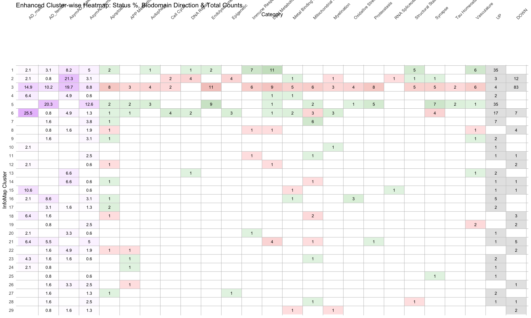
ggplot(merged_data, aes(x = Category, y = InfoMap_cluster)) +
geom_tile(aes(fill = fill_color), color = "white", linewidth = 0.4) + # Cell border
geom_text(aes(label = round(Value, 1)), size = 5) +
scale_fill_identity() +
scale_y_discrete(name = "InfoMap Cluster") +
scale_x_discrete(name = "Category", position = "top") +
# Add horizontal lines between rows (row borders)
geom_hline(yintercept = seq(1.5, length(unique(merged_data$InfoMap_cluster)) + 0.5, by = 1),
color = "gray", linewidth = 0.5) +
# Add column borders
geom_vline(xintercept = seq(1.5, length(unique(merged_data$Category)) + 0.5, by = 1),
color = "gray", linewidth = 0.5) +
theme_minimal(base_size = 18) +
theme(
axis.text.x = element_text(angle = 45, hjust = 0),
panel.grid = element_blank()
) +
labs(title = "Enhanced Cluster-wise Heatmap: Status %, Biodomain Direction & Total Counts")
#########################################################################################################################################################
#########################################################################################################################################################
# Network diagram with highlighted the clusters

# Open the graph/network structure data
#graph <- read.csv("Infomap_graph.csv", sep =",", header = TRUE, stringsAsFactors = FALSE)

graph <- read.csv("Infomap_graph_081125.csv", sep =",", header = TRUE, stringsAsFactors = FALSE)

head(graph)
##   Sno           Node1     Unique_ID                     Biodomain
## 1   1      LM_gmp_6 +      LM_gmp_6              Lipid_Metabolism
## 2   2     SS_mpod_6 +     SS_mpod_6      Structural_Stabilization
## 3   3 MBaH_oaaomi_5 + MBaH_oaaomi_5 Metal_Binding_and_Homeostasis
## 4   4  MBaH_romit_6 +  MBaH_romit_6 Metal_Binding_and_Homeostasis
## 5   5  MBaH_romit_6 +  MBaH_romit_6 Metal_Binding_and_Homeostasis
## 6   6  MBaH_romit_6 +  MBaH_romit_6 Metal_Binding_and_Homeostasis
##                                        Subdomain
## 1                   glycolipid_metabolic_process
## 2 microtubule_polymerization_or_depolymerization
## 3  oxidoreductase_activity,_acting_on_metal_ions
## 4              regulation_of_metal_ion_transport
## 5              regulation_of_metal_ion_transport
## 6              regulation_of_metal_ion_transport
##                                                           Biodomain_Subdomain
## 1                               Lipid_Metabolism_glycolipid_metabolic_process
## 2     Structural_Stabilization_microtubule_polymerization_or_depolymerization
## 3 Metal_Binding_and_Homeostasis_oxidoreductase_activity,_acting_on_metal_ions
## 4             Metal_Binding_and_Homeostasis_regulation_of_metal_ion_transport
## 5             Metal_Binding_and_Homeostasis_regulation_of_metal_ion_transport
## 6             Metal_Binding_and_Homeostasis_regulation_of_metal_ion_transport
##   Interaction      IDs      Status       Node2
## 1          PP b63.132N AsymAD_male  AsymAD_M_2
## 2          PP b54.129N AsymAD_male AsymAD_M_13
## 3          PP b52.128N AsymAD_male AsymAD_M_24
## 4          PP b62.130C AsymAD_male  AsymAD_M_8
## 5          PP b58.127C AsymAD_male AsymAD_M_31
## 6          PP b11.128C AsymAD_male  AsymAD_M_5
# Open the graph/network attributes data
#attributes <- read.csv("Infomap_graph_attributes.csv", sep =",", header = TRUE, stringsAsFactors = FALSE)

attributes <- read.csv("Infomap_graph_attributes_081125.csv", sep =",", header = TRUE, stringsAsFactors = FALSE)

head(attributes)
##        Nodes    Attributes InfoMap_cluster
## 1     AD_F_4     AD_female               1
## 2     AD_F_3     AD_female               1
## 3     AD_F_2     AD_female               1
## 4     AD_F_1     AD_female               1
## 5     AD_M_1       AD_male               1
## 6 AsymAD_F_8 AsymAD_female               1
#########################################################################################################################################################
# 1. Prepare edge list
edges <- graph %>%
rename(from = Node1, to = Node2) %>%
select(from, to)
# 2. Create node list from unique nodes in edges
edge_nodes <- unique(c(edges$from, edges$to)) %>%
tibble(name = .)
# 3. Prepare attribute data
attributes_clean <- attributes %>%
rename(name = Nodes) %>%
select(name, Attributes, InfoMap_cluster)
# 4. Merge to form complete node metadata
nodes <- edge_nodes %>%
left_join(attributes_clean, by = "name") %>%
mutate(
Attr = replace_na(Attributes, "Unassigned"),
InfomapCluster = as.integer(InfoMap_cluster),
NodeShape = case_when(
Attr %in% c("UP", "DOWN") ~ "AD Subdomain",
Attr %in% c("AD_male", "AD_female", "AsymAD_male", "AsymAD_female") ~ "AD Subject",
TRUE ~ "circle"
)
)
# 5. Create zero-padded cluster labels
unique_clusters <- sort(unique(nodes$InfomapCluster[!is.na(nodes$InfomapCluster)]))
ordered_labels <- sprintf("Cluster %02d", unique_clusters)
nodes <- nodes %>%
mutate(
ClusterLabel = sprintf("Cluster %02d", InfomapCluster),
ClusterLabel = factor(ClusterLabel, levels = ordered_labels)
)
# 6. Define shape and color mappings
shape_map <- c(
"AD Subdomain" = 15, # square
"AD Subject" = 16 # circle
)
attr_colors <- c(
"UP" = "seagreen1",
"DOWN" = "thistle1",
"AD_male" = "mediumblue",
"AD_female" = "tomato",
"AsymAD_male" = "dodgerblue",
"AsymAD_female" = "coral",
"Unassigned" = "gray70"
)
# 7. Create graph
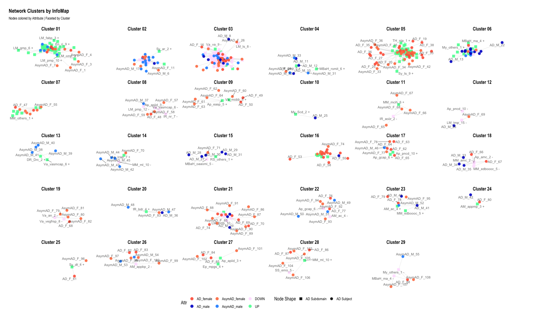
g <- graph_from_data_frame(d = edges, vertices = nodes, directed = FALSE)
# 8. Plot graph
ggraph(g, layout = "graphopt") +
geom_edge_link(alpha = 0.2, color = "gray60") +
geom_node_point(aes(color = Attr, shape = NodeShape), size = 4, alpha = 0.9) + # <--- added shape aesthetic
geom_node_text(aes(label = name), size = 4, repel = TRUE, alpha = 0.6) +
scale_color_manual(values = attr_colors) +
scale_shape_manual(values = shape_map) +
facet_nodes(~ ClusterLabel) +
theme_graph(base_size = 16) +
theme(
legend.position = "bottom",
strip.text = element_text(size = 16)
) +
labs(
title = "Network Clusters by InfoMap",
subtitle = "Nodes colored by Attribute | Faceted by Cluster",
shape = "Node Shape"
)
## Warning: ggrepel: 44 unlabeled data points (too many overlaps). Consider
## increasing max.overlaps
## Warning: ggrepel: 12 unlabeled data points (too many overlaps). Consider
## increasing max.overlaps
## Warning: ggrepel: 31 unlabeled data points (too many overlaps). Consider
## increasing max.overlaps
## Warning: ggrepel: 128 unlabeled data points (too many overlaps). Consider
## increasing max.overlaps
## Warning: ggrepel: 12 unlabeled data points (too many overlaps). Consider
## increasing max.overlaps
## Warning: ggrepel: 18 unlabeled data points (too many overlaps). Consider
## increasing max.overlaps
## Warning: ggrepel: 66 unlabeled data points (too many overlaps). Consider
## increasing max.overlaps
## Warning: ggrepel: 38 unlabeled data points (too many overlaps). Consider
## increasing max.overlaps
#########################################################################################################################################################
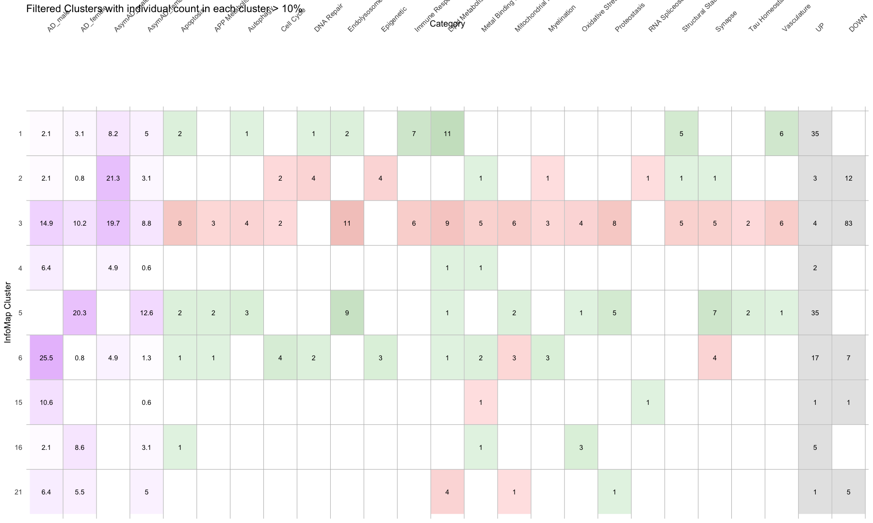
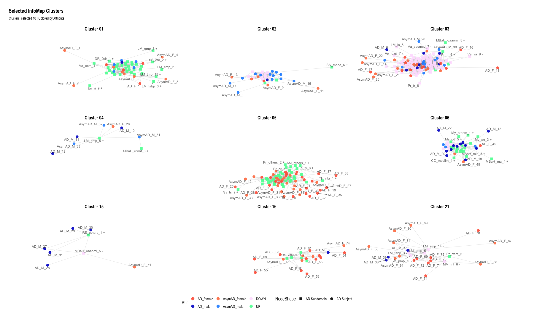
# 1. Select clusters of interest
selected_clusters <- c(1, 2, 3, 4, 5, 6, 15, 16, 21)
# Zero-padded labels like "Cluster 01", "Cluster 02", etc.
ordered_labels <- sprintf("Cluster %02d", selected_clusters)
# 5. Merge with edge node list
nodes <- edge_nodes %>%
left_join(attributes_clean, by = "name") %>%
mutate(
Attr = replace_na(Attributes, "Unassigned"),
InfomapCluster = as.integer(InfoMap_cluster)
) %>%
filter(InfomapCluster %in% selected_clusters) %>% # Filter clusters
mutate(
ClusterLabel = sprintf("Cluster %02d", InfomapCluster),
ClusterLabel = factor(ClusterLabel, levels = ordered_labels)
) %>%
mutate(NodeShape = case_when(
Attr %in% c("UP", "DOWN") ~ "AD Subdomain",
Attr %in% c("AD_male", "AD_female", "AsymAD_male", "AsymAD_female") ~ "AD Subject",
TRUE ~ "circle" # fallback for Unassigned or others
))
# 7. Filter edges to only those between selected nodes
edges_filtered <- edges %>%
filter(from %in% nodes$name & to %in% nodes$name)
# 8. Create graph
g <- graph_from_data_frame(d = edges_filtered, vertices = nodes, directed = FALSE)
# 9. Plot
ggraph(g, layout = "graphopt") +
geom_edge_link(alpha = 0.2, color = "gray60") +
geom_node_point(aes(color = Attr, shape = NodeShape), size = 4, alpha = 0.9) +
geom_node_text(aes(label = name), size = 4, repel = TRUE, alpha = 0.6) +
scale_color_manual(values = attr_colors) +
scale_shape_manual(values = shape_map) +
facet_nodes(~ ClusterLabel, ncol = 3) + # Respects selected and ordered clusters
theme_graph(base_size = 16) +
theme(
legend.position = "bottom",
strip.text = element_text(size = 16)
) +
labs(
title = "Selected InfoMap Clusters",
subtitle = "Clusters: selected 10 | Colored by Attribute"
)
## Warning: ggrepel: 39 unlabeled data points (too many overlaps). Consider
## increasing max.overlaps
## Warning: ggrepel: 28 unlabeled data points (too many overlaps). Consider
## increasing max.overlaps
## Warning: ggrepel: 57 unlabeled data points (too many overlaps). Consider
## increasing max.overlaps
## Warning: ggrepel: 10 unlabeled data points (too many overlaps). Consider
## increasing max.overlaps
## Warning: ggrepel: 116 unlabeled data points (too many overlaps). Consider
## increasing max.overlaps
## Warning: ggrepel: 30 unlabeled data points (too many overlaps). Consider
## increasing max.overlaps
## Warning: ggrepel: 1 unlabeled data points (too many overlaps). Consider
## increasing max.overlaps
#########################################################################################################################################################
#########################################################################################################################################################
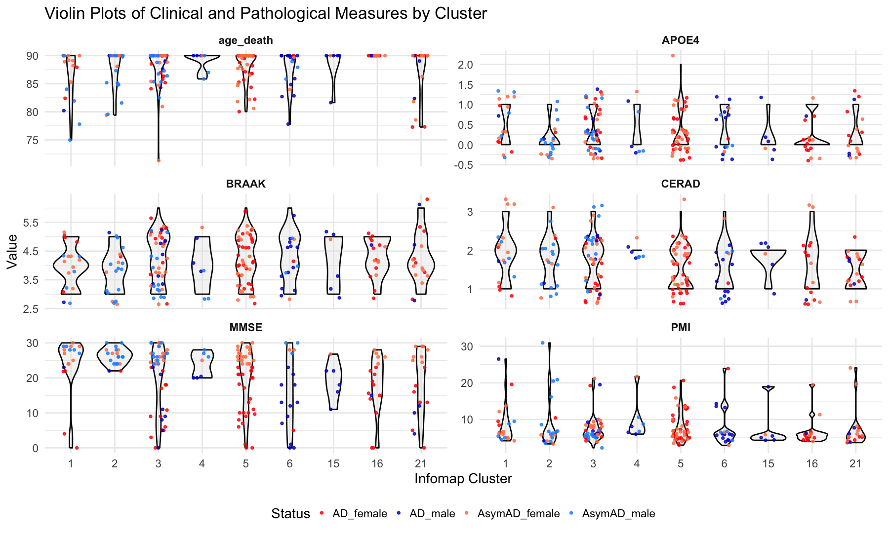
# Boxplots of Clinical and Pathological Measures by Cluster
library(ggplot2)
library(dplyr)
library(tidyr)
library(rstatix) # cleaner statistical output
##
## Attaching package: 'rstatix'
##
## The following object is masked from 'package:stats':
##
##     filter
#data <- read.csv("Infomap_clusters_with_clinicalParameters.csv", sep =",", header = TRUE, stringsAsFactors = FALSE)

data <- read.csv("Infomap_clusters_with_clinicalParameters_082525.csv", sep =",", header = TRUE, stringsAsFactors = FALSE)

head(data)
##   Sno Sample_ID        Status Infomap_cluster age_death       PMI APOE4 BRAAK
## 1   1  b44.128C     AD_female               1  90.00000  8.450000     0     5
## 2   2  b64.131N     AD_female               1  82.40383  6.500000     1     5
## 3   3  b36.127N     AD_female               1  90.00000  9.500000     0     3
## 4   4  b15.130N     AD_female               1  87.93000 19.580000     0     5
## 5  89  b47.128C       AD_male               1  80.21000 26.500000     1     3
## 6 131  b51.132C AsymAD_female               1  90.00000  4.183333     1     4
##   CERAD     MMSE
## 1     1  4.00000
## 2     1 22.00000
## 3     2 21.81818
## 4     1  0.00000
## 5     2 23.00000
## 6     3 29.00000
# Step 1: Pivot data to long format from age_death onward
data_long <- data %>%
    pivot_longer(
        cols = age_death:MMSE,  # Select columns to plot
        names_to = "Variable",
        values_to = "Value"
    )

# Step 2: Convert columns to factors (if needed)
data_long$Infomap_cluster <- factor(data_long$Infomap_cluster)
data_long$Status <- factor(data_long$Status)


# Step 3:Define custom colors
custom_colors <- c(
    "AD_male" = "mediumblue",
    "AD_female" = "red",
    "AsymAD_male" = "dodgerblue",
    "AsymAD_female" = "coral"
)


# Step 4: Plot
ggplot(data_long, aes(x = Infomap_cluster, y = Value)) +
    geom_violin(fill = "gray90", color = "black", alpha = 0.4, width = 0.8) +  # violin instead of boxplot
    geom_jitter(aes(color = Status), position = position_jitter(width = 0.2), size = 1.8, alpha = 0.8) +
    facet_wrap(~ Variable, scales = "free_y", ncol = 2) +
    labs(
        title = "Violin Plots of Clinical and Pathological Measures by Cluster",
        x = "Infomap Cluster",
        y = "Value"
    ) +
    theme_minimal(base_size = 28) +
    theme(
        legend.position = "bottom",
        strip.text = element_text(face = "bold")
    ) +
    scale_color_manual(values = custom_colors)
## Warning: Removed 4 rows containing non-finite outside the scale range
## (`stat_ydensity()`).
## Warning: Removed 4 rows containing missing values or values outside the scale range
## (`geom_point()`).
#########################################################################################################################################################
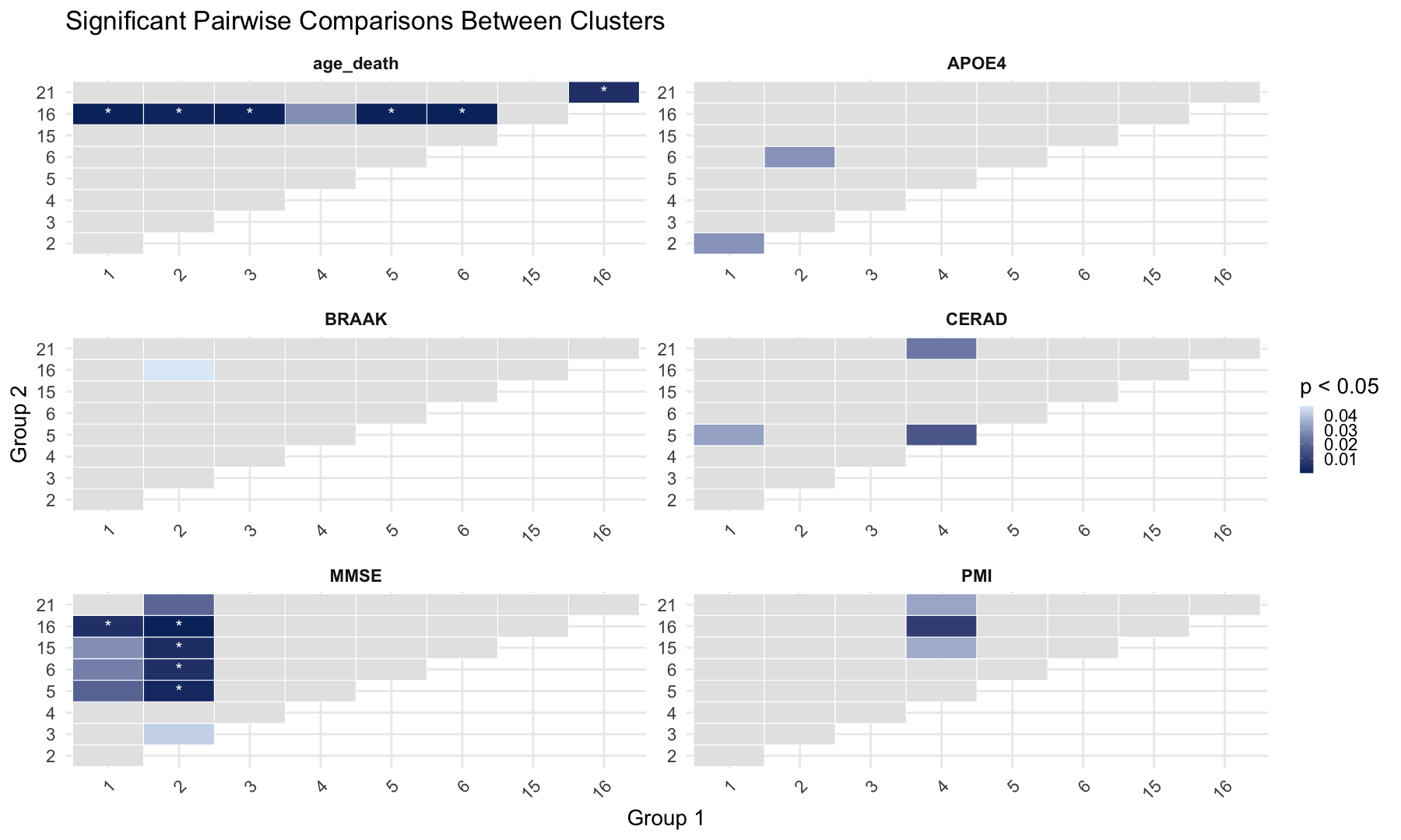
#Pairwise Comparisons Between Clusters
# Prepare data if not already done
data_long <- data %>%
pivot_longer(
cols = age_death:MMSE,
names_to = "Variable",
values_to = "Value"
) %>%
mutate(
Infomap_cluster = factor(Infomap_cluster),
Status = factor(Status)
)
# Step 1: Run pairwise Wilcoxon for all variables
pairwise_results <- data_long %>%
drop_na(Value, Infomap_cluster) %>%
group_by(Variable) %>%
group_modify(~ {
tryCatch(
{
res <- pairwise_wilcox_test(.x, Value ~ Infomap_cluster, p.adjust.method = "fdr")
res$Variable <- unique(.x$Variable) # tag results with variable name
res
},
error = function(e) {
# return a placeholder row with NA if test fails
tibble(
group1 = NA, group2 = NA, p = NA, p.adj = NA, p.adj.signif = NA,
Variable = unique(.x$Variable)
)
}
)
}) %>%
ungroup()
## Warning: Unknown or uninitialised column: `Variable`.
## Warning: Unknown or uninitialised column: `Variable`.
## Unknown or uninitialised column: `Variable`.
## Unknown or uninitialised column: `Variable`.
## Unknown or uninitialised column: `Variable`.
## Unknown or uninitialised column: `Variable`.
# Step 2: Filter significant results (if any)
significant_results <- pairwise_results %>%
  filter(!is.na(p.adj) & p.adj < 0.05)

# Step 3: Print significant comparisons
print(significant_results)
## # A tibble: 11 × 10
##    Variable .y.   group1 group2    n1    n2 statistic       p p.adj p.adj.signif
##    <chr>    <chr> <chr>  <chr>  <int> <int>     <dbl>   <dbl> <dbl> <chr>
##  1 MMSE     Value 1      16        18    17      238. 5   e-3 0.035 *
##  2 MMSE     Value 2      5         20    46      686. 2   e-3 0.028 *
##  3 MMSE     Value 2      6         20    18      276. 5   e-3 0.035 *
##  4 MMSE     Value 2      15        20     6      107  4   e-3 0.035 *
##  5 MMSE     Value 2      16        20    17      287  3.6 e-4 0.013 *
##  6 age_dea… Value 1      16        18    17       51  7.57e-5 0.001 **
##  7 age_dea… Value 2      16        20    17       85  9.92e-4 0.007 **
##  8 age_dea… Value 3      16        46    17      196. 4.65e-4 0.004 **
##  9 age_dea… Value 5      16        46    17      196. 4.65e-4 0.004 **
## 10 age_dea… Value 6      16        18    17       51  7.57e-5 0.001 **
## 11 age_dea… Value 16     21        17    18      212. 5   e-3 0.032 *
write.table(pairwise_results,"Clinical_and_Pathological_Measures_by_Cluster.txt",sep="\t",quote=F)

#########################################################################################################################################################
# Step 1: Prepare data
heat_data <- pairwise_results %>%
    mutate(
        group1 = factor(as.numeric(as.character(group1))),
        group2 = factor(as.numeric(as.character(group2))),
        p_display = ifelse(p < 0.05, p, NA),         # show only p < 0.05 in gradient
        label = ifelse(p.adj < 0.05, "*", "")
    )

# Define group order
ordered_levels <- sort(unique(c(as.numeric(as.character(heat_data$group1)),
                                as.numeric(as.character(heat_data$group2)))))
heat_data$group1 <- factor(heat_data$group1, levels = ordered_levels)
heat_data$group2 <- factor(heat_data$group2, levels = ordered_levels)

# Step 2: Plot
ggplot(heat_data, aes(x = group1, y = group2, fill = p_display)) +
    geom_tile(color = "white") +
    geom_text(aes(label = label), color = "white", size = 8) +
    facet_wrap(~ Variable, scales = "free", ncol = 2) +
    scale_fill_gradient(
        name = "p < 0.05",
        low = "#08306b", high = "#deebf7",
        na.value = "gray90"  # p >= 0.05 will appear gray
    ) +
    labs(
        title = "Significant Pairwise Comparisons Between Clusters",
        x = "Group 1",
        y = "Group 2"
    ) +
    theme_minimal(base_size = 28) +
    theme(
        axis.text.x = element_text(angle = 45, hjust = 1),
        strip.text = element_text(face = "bold")
    )
#########################################################################################################################################################
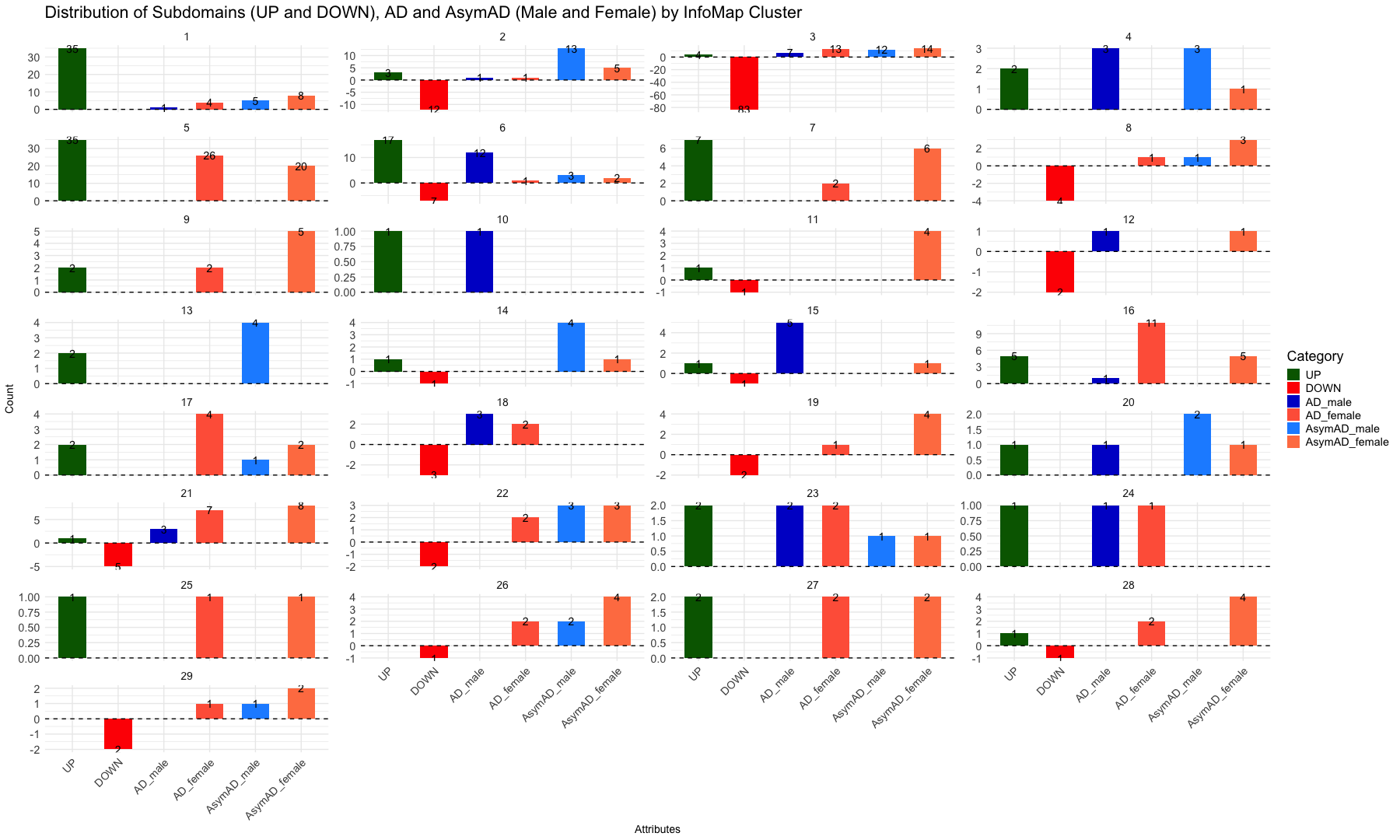
#########################################################################################################################################################
# Selct the clusters for ploting (change according to criteria)
#selected_clusters <- c(1, 3, 4, 6, 11, 12, 15, 18)
# Create a subset of original file
#infomap_clusters <- infomap_clusters %>%
#filter(InfoMap_cluster %in% selected_clusters)
# Categorize rows into Attributes (UP, DOWN, AD_male, AD_female, AsymaAD_male and AsymAD_female)
infomap_clusters <- infomap_clusters %>%
mutate(
Category = case_when(
Attributes %in% c("UP", "DOWN") ~ Attributes,
Attributes %in% c("AD_male", "AD_female", "AsymAD_male", "AsymAD_female") ~ Attributes,
TRUE ~ NA_character_
)
) %>%
filter(!is.na(Category)) # Keep only rows with valid categories
# Assign negative values to DOWN counts
infomap_clusters <- infomap_clusters %>%
mutate(
Value = case_when(
Category == "DOWN" ~ -1,
TRUE ~ 1
)
)
# Count occurrences of each Category within each InfoMap_cluster
summary_infomap_clusters <- infomap_clusters %>%
group_by(InfoMap_cluster, Category) %>%
summarise(Count = n(), .groups = "drop")
# Set factor levels for ordered categories
summary_infomap_clusters$Category <- factor(summary_infomap_clusters$Category, levels = c("UP", "DOWN", "AD_male", "AD_female", "AsymAD_male", "AsymAD_female"))
# Custom colors for the bars
custom_colors <- c("UP" = "darkgreen", "DOWN" = "red", "AD_male" = "mediumblue", "AD_female" = "tomato", "AsymAD_male" = "dodgerblue", "AsymAD_female" = "coral")
# Create the bar plot
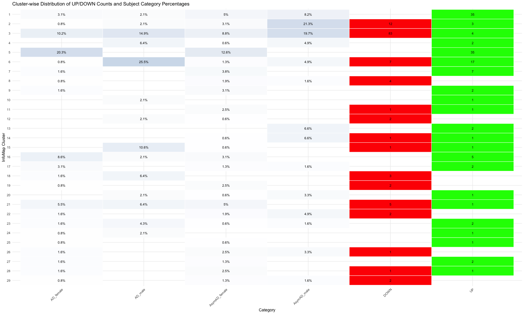
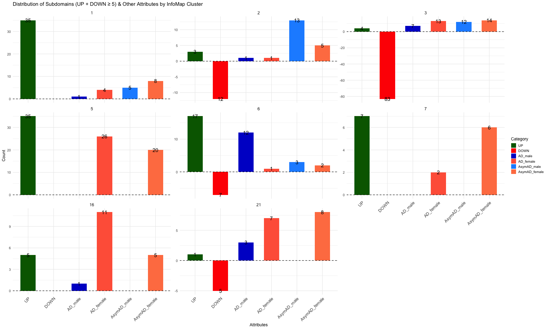
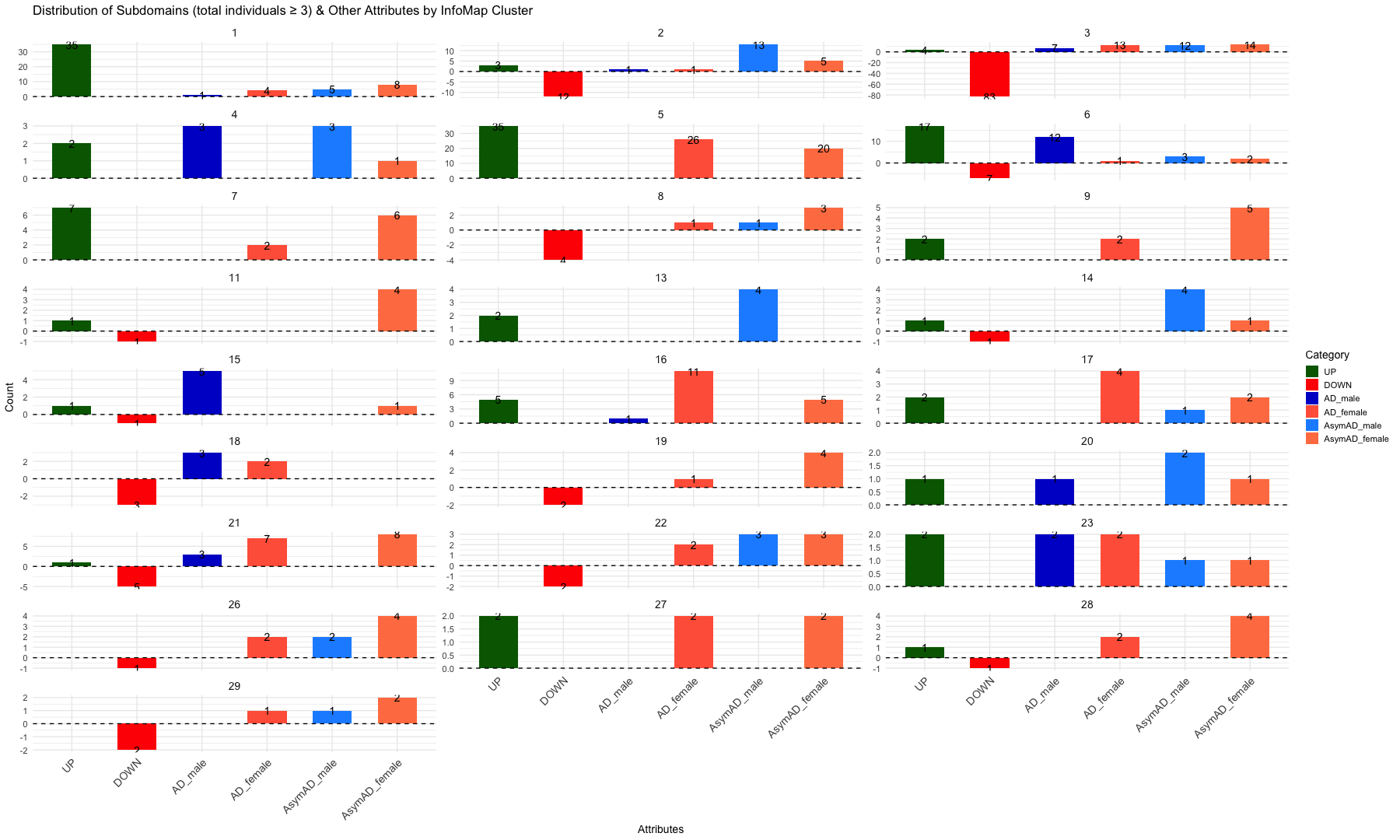
ggplot(summary_infomap_clusters, aes(x = Category, y = ifelse(Category == "DOWN", -Count, Count), fill = Category)) +
geom_bar(stat = "identity", width = 0.6, position = position_dodge(width = 0.9)) +
geom_text(
aes(label = abs(Count)),
vjust = 0.5, # Center the text vertically within the bar
size = 5,
position = position_dodge(width = 0.9)
) +
facet_wrap(~ InfoMap_cluster, ncol = 4, scales = "free_y") + # Adjust `ncol` for desired layout
labs(
title = "Distribution of Subdomains (UP and DOWN), AD and AsymAD (Male and Female) by InfoMap Cluster",
x = "Attributes",
y = "Count",
fill = "Category"
) +
theme_minimal(base_size = 14) +
scale_fill_manual(values = custom_colors) + # Apply custom colors
theme(
text = element_text(size = 18),
axis.text.x = element_text(size = 14, angle = 45, hjust = 1),
axis.title = element_text(size = 14),
strip.text = element_text(size = 14)
) +
geom_hline(yintercept = 0, linetype = "dashed", color = "black")
#########################################################################################################################################################
#########################################################################################################################################################
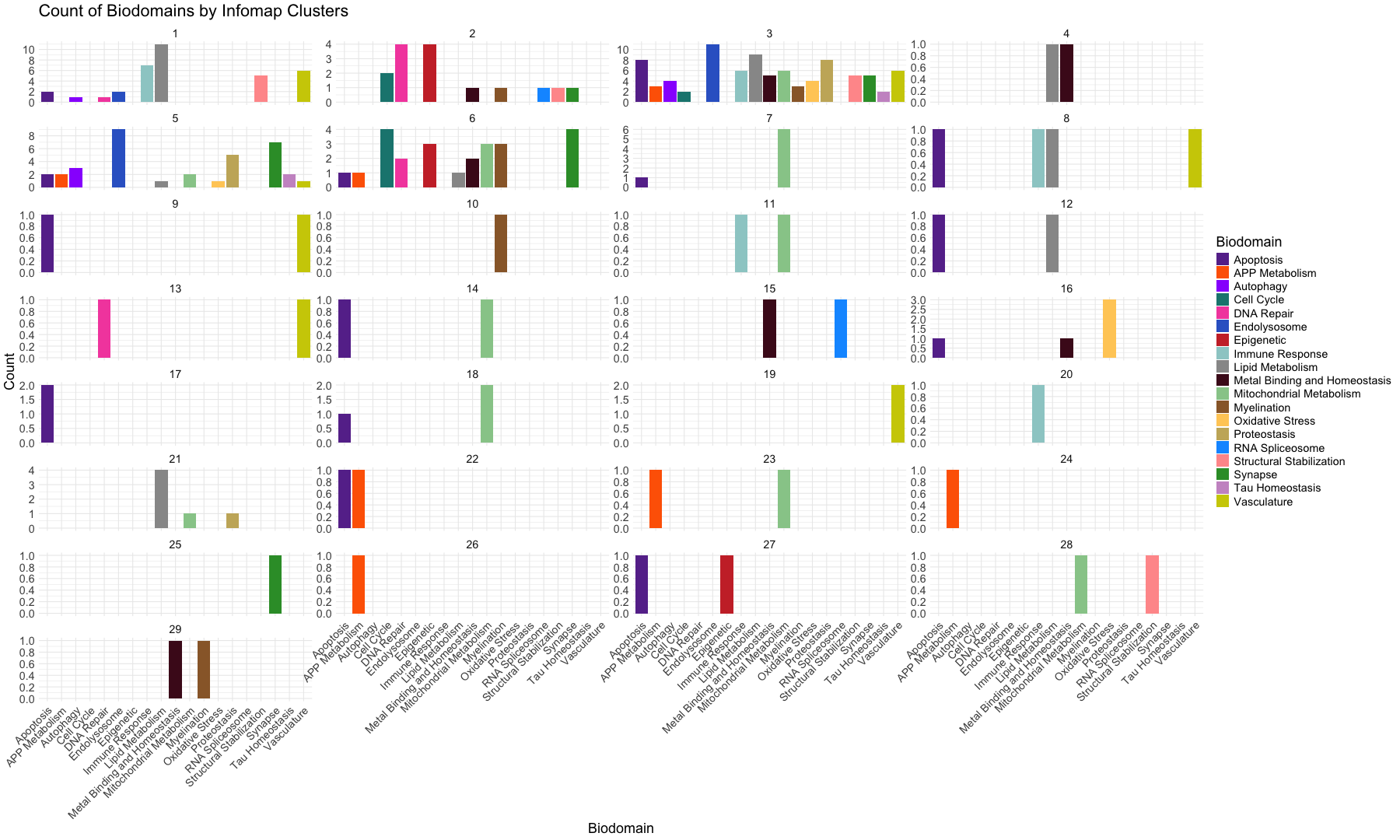
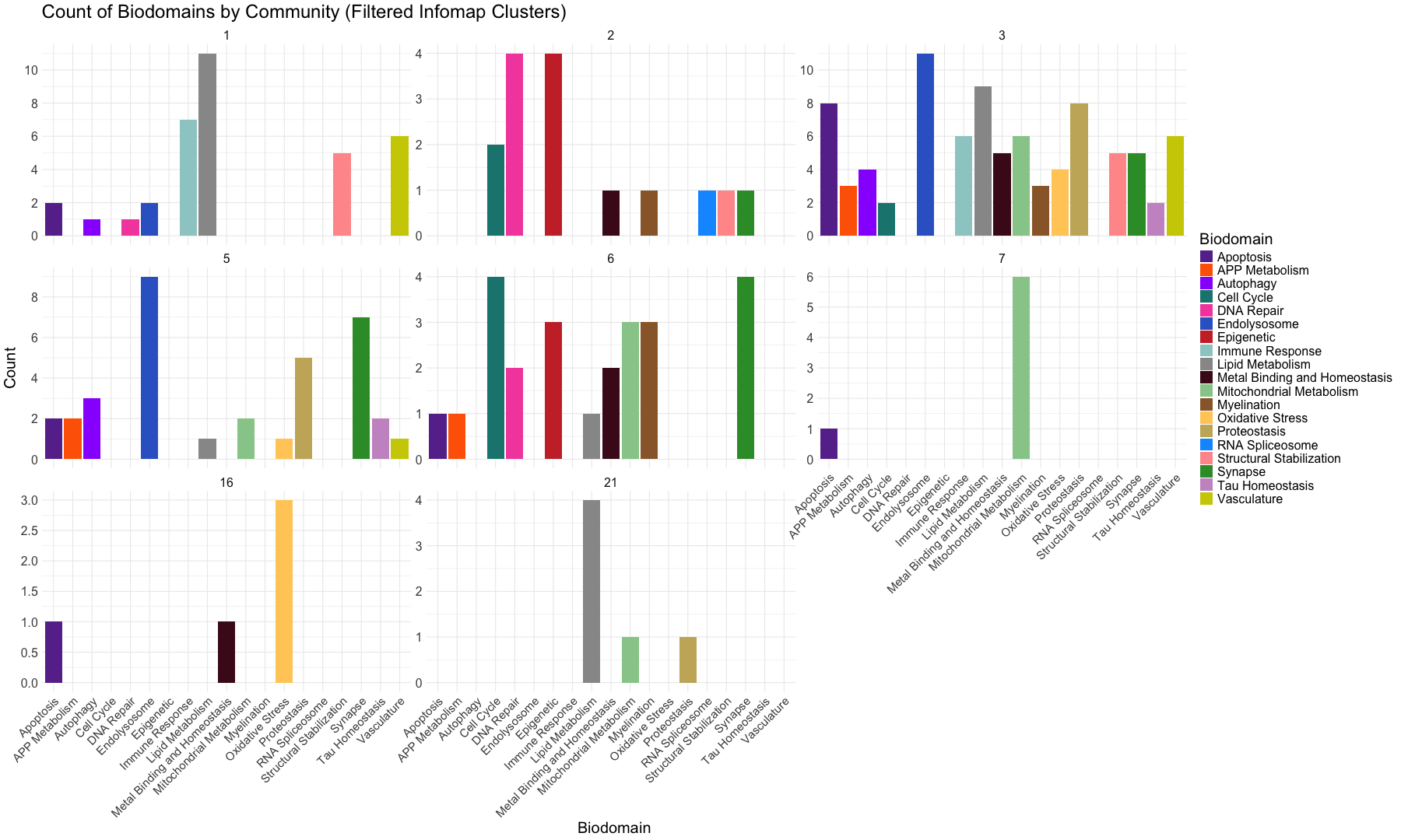
# Biodomain/Subdomain Counts by Community (Infomap Clusters)
# Define the Biodomain colors
custom_colors <- c("Apoptosis" = "#673399", "APP Metabolism" = "#fe6500", "Autophagy" = "#9931fd", "Cell Cycle" = "#18857f", "DNA Repair" = "#f451ad", "Endolysosome" = "#3466cc", "Epigenetic" = "#cb3233", "Immune Response" = "#9ccdcc", "Lipid Metabolism" = "#989898", "Metal Binding and Homeostasis" = "#4b0d20", "Mitochondrial Metabolism" = "#97cb98", "Myelination" = "#996735", "Oxidative Stress" = "#ffcd66", "Proteostasis" = "#c8b269", "RNA Spliceosome" = "#0c9aff", "Structural Stabilization" = "#ff9a9a", "Synapse" = "#329a33", "Tau Homeostasis" = "#cb97cb", "Vasculature" = "#cecd02", "none" = "#7f7f7f")
# Open the Network-based Community detection table
#infomap_clusters_sds <- read.csv("Infomap_clusters_sds.csv", sep =",", header = TRUE, stringsAsFactors = FALSE)
infomap_clusters_sds <- read.csv("Infomap_clusters_sds_081125.csv", sep =",", header = TRUE, stringsAsFactors = FALSE)
head(infomap_clusters_sds)
##   Sno InfoMap_cluster Nodes         unique_id    Biodomain
## 1 141               1    UP     Ap_others_1 +    Apoptosis
## 2 143               1    UP Ap_roceaiiap_11 +    Apoptosis
## 3 148               1    UP         Au_ph_4 +    Autophagy
## 4 153               1    UP        DR_Ddr_1 +   DNA Repair
## 5 165               1    UP        En_re_10 + Endolysosome
## 6 167               1    UP         En_ri_9 + Endolysosome
##                                                                          Subdomain
## 1                                                                             <NA>
## 2 regulation of cysteine-type endopeptidase activity involved in apoptotic process
## 3                                                                     phagocytosis
## 4                                                              DNA damage response
## 5                                                    receptor-mediated endocytosis
## 6                                                         receptor internalization
##                                                                          Biodomain_Subdomain
## 1                                                                           Apoptosis_others
## 2 Apoptosis_regulation_of_cysteine-type_endopeptidase_activity_involved_in_apoptotic_process
## 3                                                                     Autophagy_phagocytosis
## 4                                                             DNA_Repair_DNA_damage_response
## 5                                                 Endolysosome_receptor-mediated_endocytosis
## 6                                                      Endolysosome_receptor_internalization
##    X X.1 X.2 X.3 X.4
## 1 NA  NA  NA  NA  NA
## 2 NA  NA  NA  NA  NA
## 3 NA  NA  NA  NA  NA
## 4 NA  NA  NA  NA  NA
## 5 NA  NA  NA  NA  NA
## 6 NA  NA  NA  NA  NA
# Selct the clusters for ploting (change according to criteria)
#selected_clusters <- c(1, 3, 4, 6, 11, 12, 15, 18)

# Create a subset of original file
#infomap_clusters_sds <- infomap_clusters_sds %>%
  #filter(InfoMap_cluster %in% selected_clusters)


# Plot the data as bar graph for each cluster
ggplot(infomap_clusters_sds, aes(x = Biodomain)) +
     geom_bar(aes(fill = Biodomain)) +  # Bar plot with fill by Biodomain
     labs(title = "Count of Biodomains by Infomap Clusters",
          x = "Biodomain",
          y = "Count") +
     facet_wrap(~InfoMap_cluster, ncol = 4, scales = "free_y") +  # Facet based on Community with free y-axis scaling
     theme_minimal() +
     theme(axis.text.x = element_text(angle = 45, hjust = 1, size = 14)) +
     scale_fill_manual(values = custom_colors) +
     theme(text = element_text(size = 18)) +
     scale_y_continuous(breaks = scales::pretty_breaks(n = 5)) # Rounded Y-axis