##
## Attaching package: 'gplots'
## The following object is masked from 'package:stats':
##
##     lowess
## Warning: package 'ggplot2' was built under R version 4.5.2
library(reshape2)
library(RColorBrewer)
library(dplyr)
##
## Attaching package: 'dplyr'
## The following objects are masked from 'package:stats':
##
##     filter, lag
## The following objects are masked from 'package:base':
##
##     intersect, setdiff, setequal, union
## Loading required package: viridisLite
library(ggrepel)
library(corrplot)
##
## Attaching package: 'plotly'
## The following object is masked from 'package:ggplot2':
##
##     last_plot
## The following object is masked from 'package:stats':
##
##     filter
## The following object is masked from 'package:graphics':
##
##     layout
library(patchwork)
library(stringr)


# Open subdomains comparison file"
#data_subdomain <- read.csv("comarative_subdomain_results.csv", sep =",", header = TRUE, stringsAsFactors = FALSE)

data_subdomain <- read.csv("comarative_subdomain_results_050525.csv", sep =",", header = TRUE, stringsAsFactors = FALSE)


# Truncate long Biodomain_Subdomain names to 40 characters
data_subdomain <- data_subdomain %>%
  mutate(Biodomain_Subdomain = str_trunc(Biodomain_Subdomain, width = 40))


# Removing the 1st and 2nd columns
data_subdomain_new_UP <- data_subdomain[, -c(1, 2, 3, 4, 7, 9, 11, 13)]

head(data_subdomain_new_UP)
##                        Biodomain_Subdomain UP_ratio_AD_female UP_ratio_AD_male
## 1    APP Metabolism_amyloid-beta clearance          0.1015625       0.08510638
## 2    APP Metabolism_amyloid-beta formation          0.1875000       0.00000000
## 3 APP Metabolism_amyloid precursor prot...          0.0000000       0.10638298
## 4 APP Metabolism_amyloid precursor prot...          0.0234375       0.04255319
## 5                     APP Metabolism_other          0.0234375       0.04255319
## 6 Apoptosis_apoptotic mitochondrial cha...          0.0390625       0.00000000
##   UP_ratio_AsymAD_female UP_ratio_AsymAD_male
## 1            0.050314465           0.04918033
## 2            0.157232704           0.03278689
## 3            0.006289308           0.08196721
## 4            0.012578616           0.01639344
## 5            0.031446541           0.01639344
## 6            0.050314465           0.00000000
data_subdomain_new_DOWN <- data_subdomain[, -c(1, 2, 3, 4, 6, 8, 10, 12)]

head(data_subdomain_new_DOWN)
##                        Biodomain_Subdomain DOWN_ratio_AD_female
## 1    APP Metabolism_amyloid-beta clearance            0.0234375
## 2    APP Metabolism_amyloid-beta formation            0.0234375
## 3 APP Metabolism_amyloid precursor prot...            0.0781250
## 4 APP Metabolism_amyloid precursor prot...            0.0078125
## 5                     APP Metabolism_other            0.0156250
## 6 Apoptosis_apoptotic mitochondrial cha...            0.0546875
##   DOWN_ratio_AD_male DOWN_ratio_AsymAD_female DOWN_ratio_AsymAD_male
## 1         0.00000000              0.006289308             0.01639344
## 2         0.06382979              0.006289308             0.06557377
## 3         0.06382979              0.056603774             0.09836066
## 4         0.04255319              0.006289308             0.00000000
## 5         0.06382979              0.025157233             0.03278689
## 6         0.12765957              0.012578616             0.03278689
data_matrix_subdomain_UP <- data_subdomain_new_UP[, -1]
# Reorder the columns
data_matrix_subdomain_UP <- data_matrix_subdomain_UP[, c(
"UP_ratio_AD_female",
"UP_ratio_AsymAD_female",
"UP_ratio_AD_male",
"UP_ratio_AsymAD_male"
)]
data_matrix_subdomain_DOWN <- data_subdomain_new_DOWN[, -1]
# Reorder the columns
data_matrix_subdomain_DOWN <- data_matrix_subdomain_DOWN[, c(
"DOWN_ratio_AD_female",
"DOWN_ratio_AsymAD_female",
"DOWN_ratio_AD_male",
"DOWN_ratio_AsymAD_male"
)]
# Replace NA values with 0 (or any other specific value)
data_matrix_subdomain_UP[is.na(data_matrix_subdomain_UP)] <- 0
data_matrix_subdomain_DOWN[is.na(data_matrix_subdomain_DOWN)] <- 0
# Set up the color scale using RColorBrewer
color_scale <- colorRampPalette(brewer.pal(9, "RdYlGn"))
# Assign custom column names
colnames(data_matrix_subdomain_UP) <- c("AD_Female", "AsymAD_Female", "AD_Male", "AsymAD_Male")
# Assign custom column names
colnames(data_matrix_subdomain_DOWN) <- c("AD_Female", "AsymAD_Female", "AD_Male", "AsymAD_Male")
# Set up the color scale using RColorBrewer
color_scale <- colorRampPalette(brewer.pal(9, "RdYlGn"))
color_scale1 <- colorRampPalette(c("white", "lightblue", "blue", "darkblue"))
color_scale2 <- colorRampPalette(brewer.pal(9, "RdGy"))
color_scale3 <- colorRampPalette(brewer.pal(9, "Greens"))
color_scale4 <- colorRampPalette(brewer.pal(9, "Blues"))
color_scale5 <- colorRampPalette(brewer.pal(9, "Purples"))
color_scale6 <- colorRampPalette(brewer.pal(9, "Oranges"))
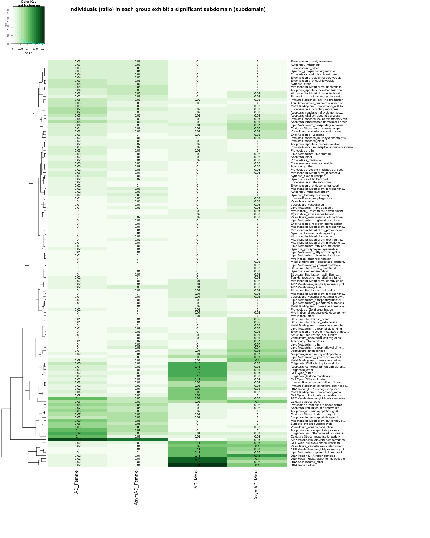
heatmap.2(
as.matrix(data_matrix_subdomain_UP),
Rowv = TRUE,
Colv = FALSE,
col = color_scale3,
scale = "none", # Scale rows (genes) to Z-scores
trace = "none", # Turn off row and column annotations
margins = c(20, 40), # Set margins for row and column labels
key = TRUE, # Include a color key
keysize = .5, # Size of the color key
cexCol = 1.5, # Set column label size
cexRow = 1, # Set row label size
cellnote=round(data_matrix_subdomain_UP, 2),
notecol="black",
labRow = data_subdomain$Biodomain_Subdomain, # Row labels (subdomain name)
dendrogram = "row", # Show both row and column dendrograms
main="Individuals (ratio) in each group exhibit a significant subdomain (subdomain)"
)
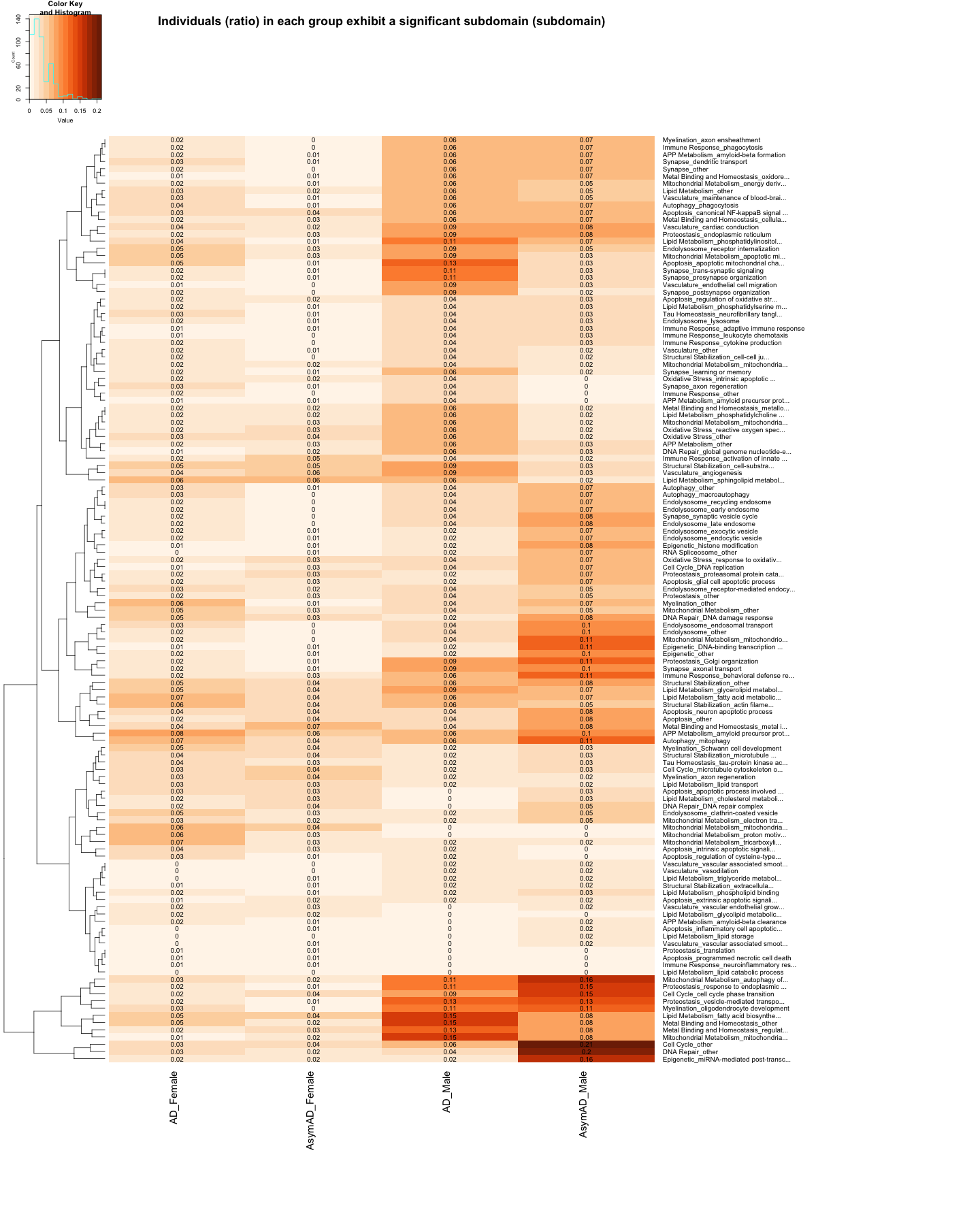
heatmap.2(
as.matrix(data_matrix_subdomain_DOWN),
Rowv = TRUE,
Colv = FALSE,
col = color_scale6,
scale = "none",  # Scale rows (genes) to Z-scores
trace = "none",  # Turn off row and column annotations
margins = c(20, 40),  # Set margins for row and column labels
key = TRUE,  # Include a color key
keysize = .5,  # Size of the color key
cexCol = 1.5,  # Set column label size
cexRow = 1,  # Set row label size
cellnote=round(data_matrix_subdomain_DOWN, 2),
notecol="black",
labRow = data_subdomain$Biodomain_Subdomain,  # Row labels (subdomain name)
dendrogram = "row",  # Show both row and column dendrograms
main="Individuals (ratio) in each group exhibit a significant subdomain (subdomain)"
)
########################################################################################################################################################################################################
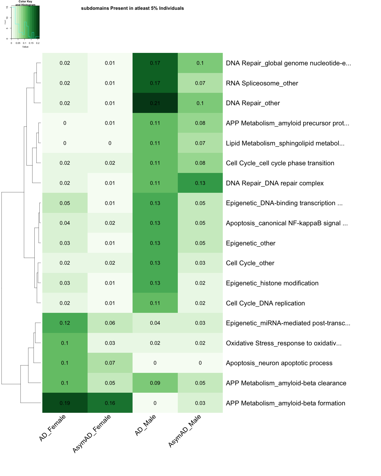
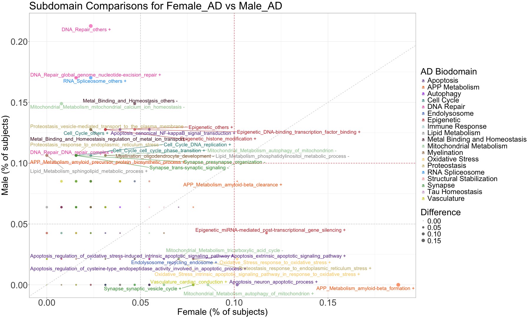
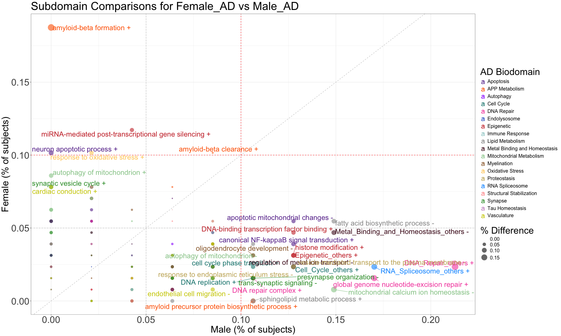
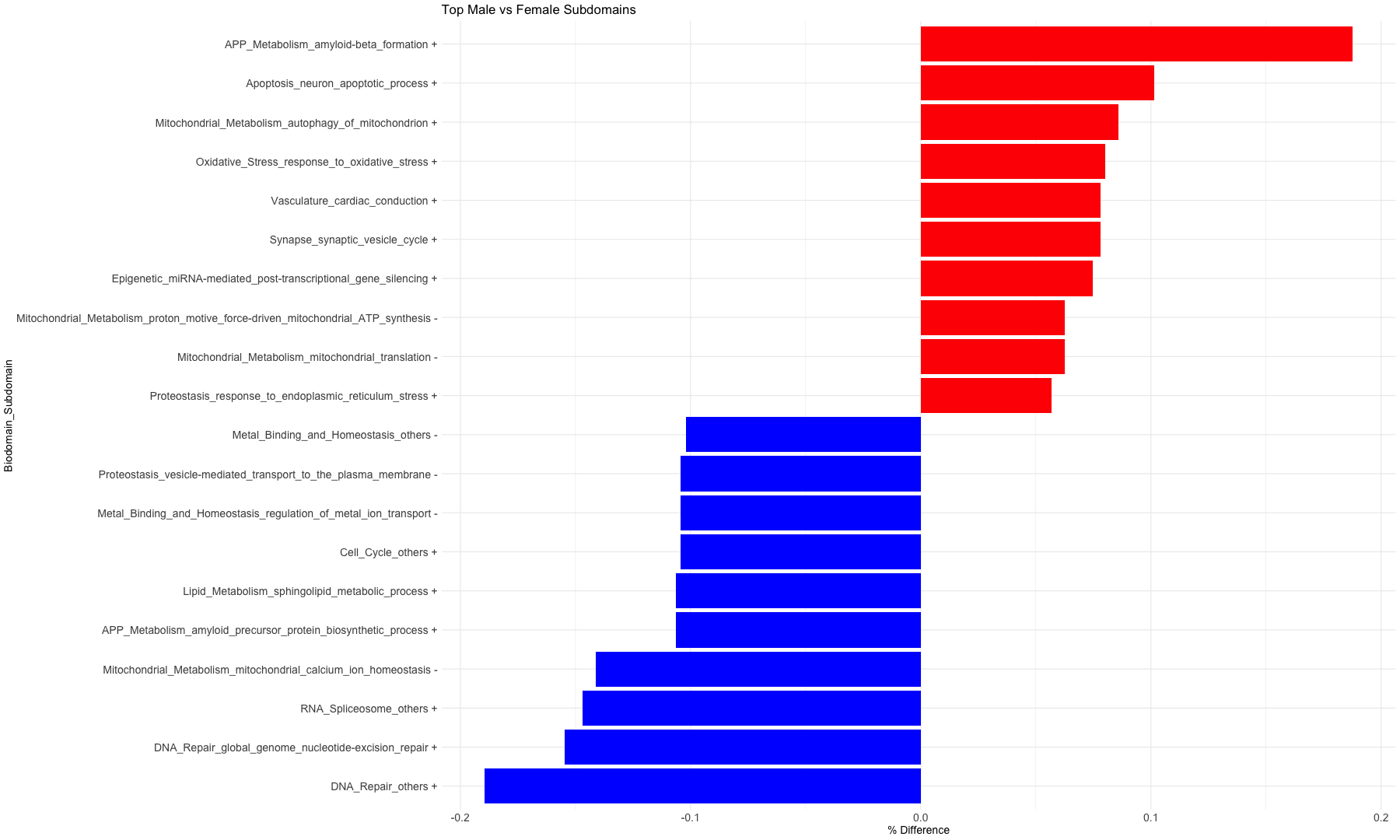
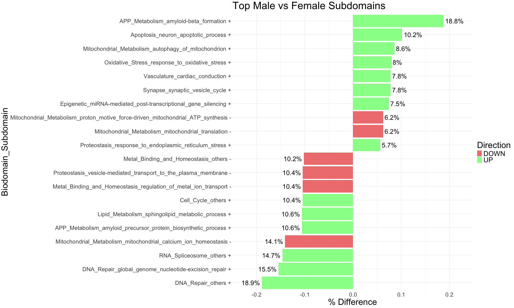
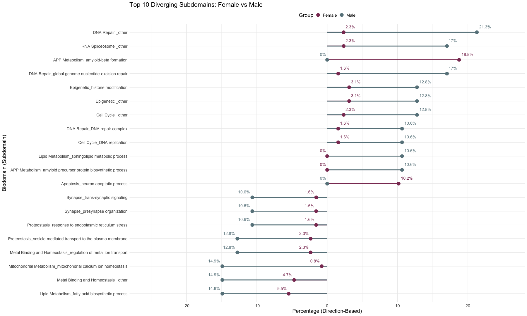
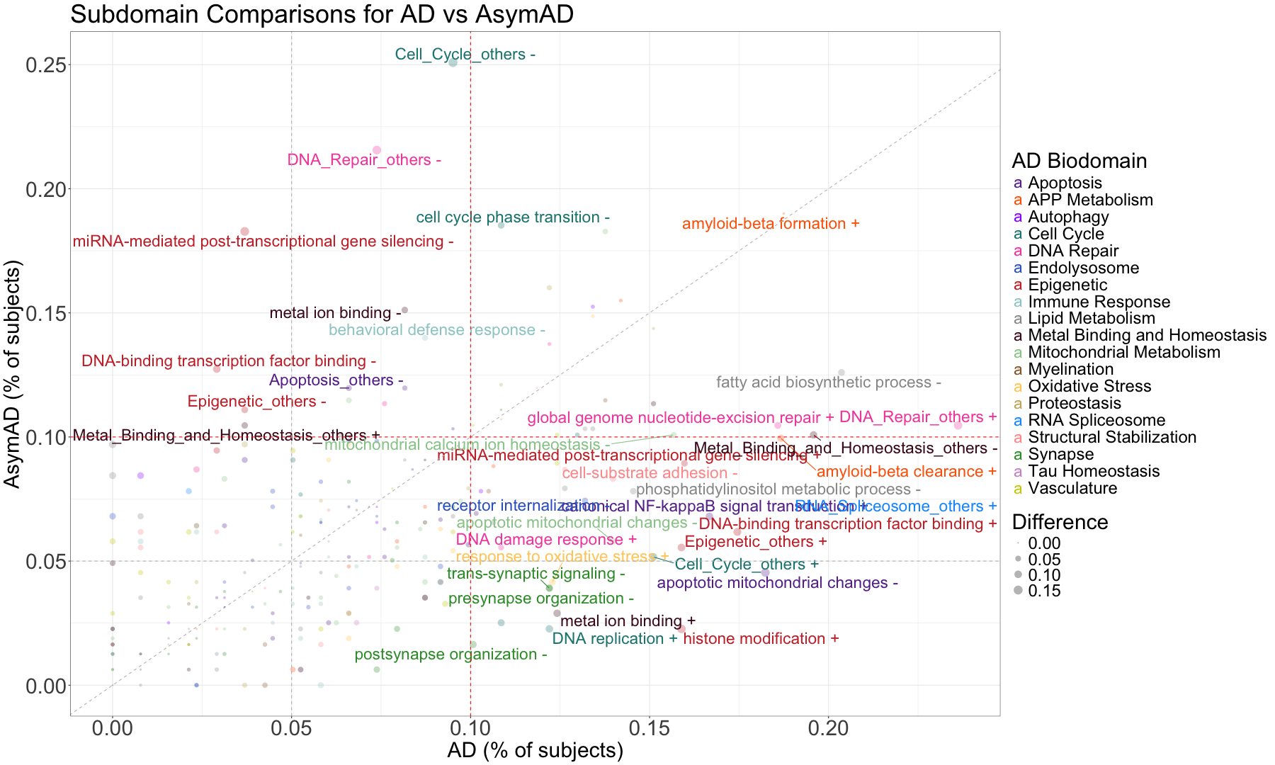
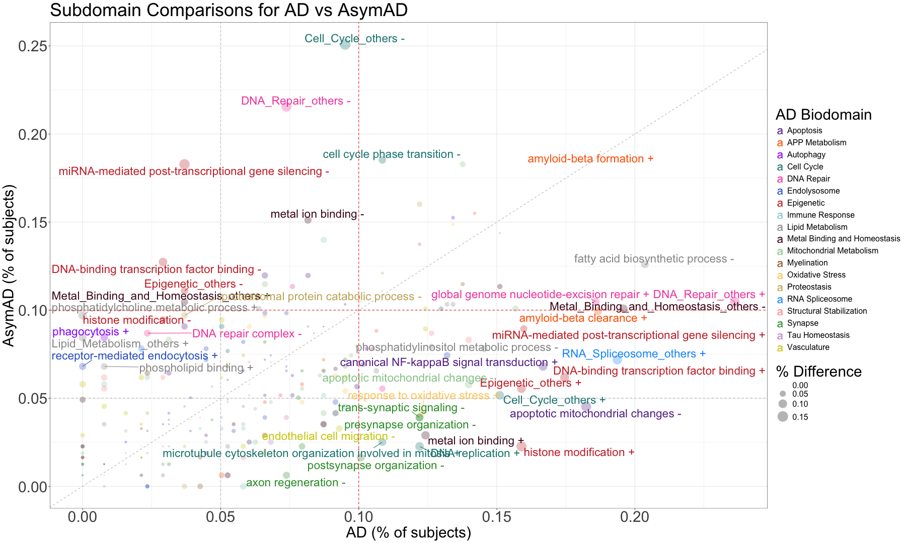
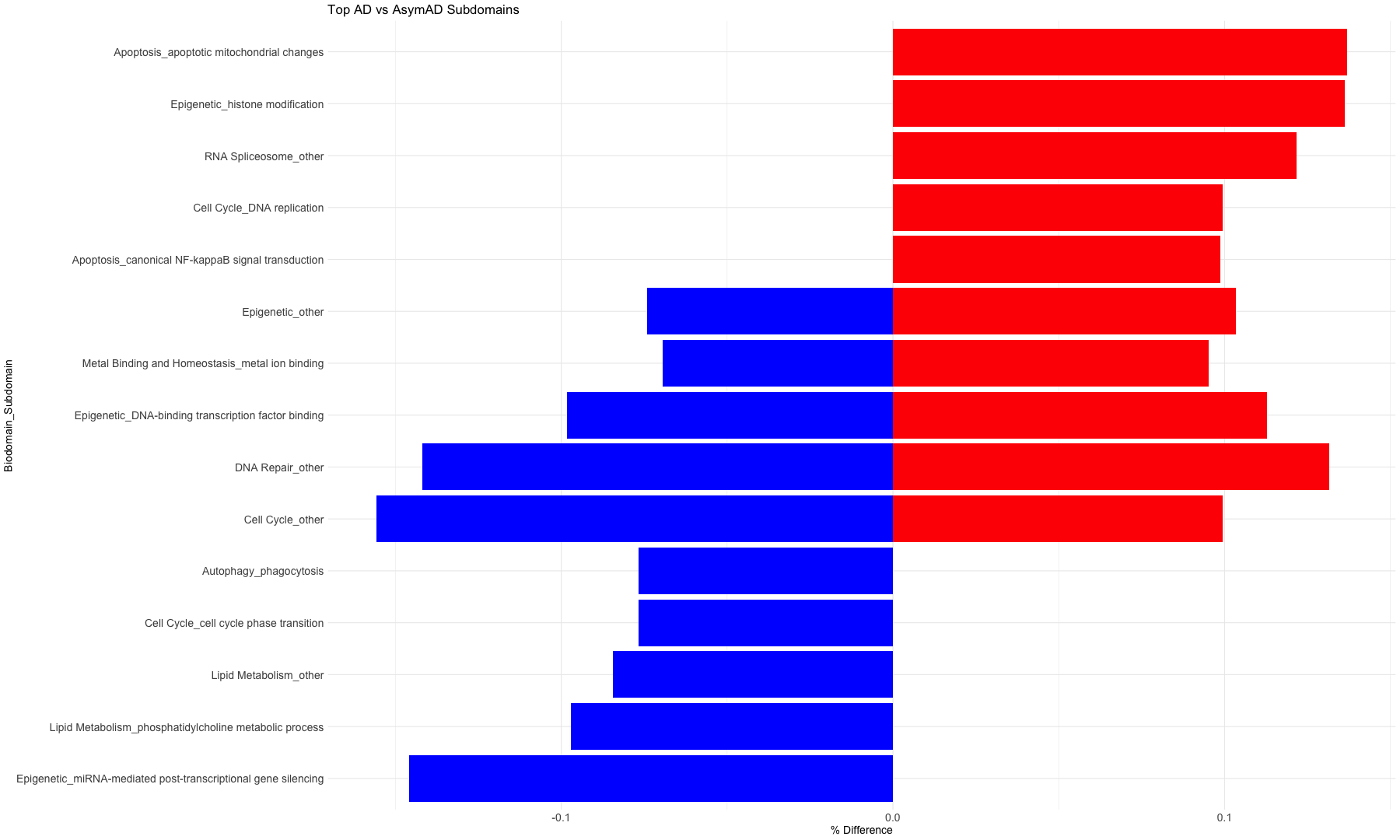
subset_data_subdomain_UP <- data_subdomain_new_UP %>% filter(UP_ratio_AD_female >= 0.10 | UP_ratio_AD_male >= 0.10 | UP_ratio_AsymAD_female >= 0.10 | UP_ratio_AsymAD_male >= 0.10)
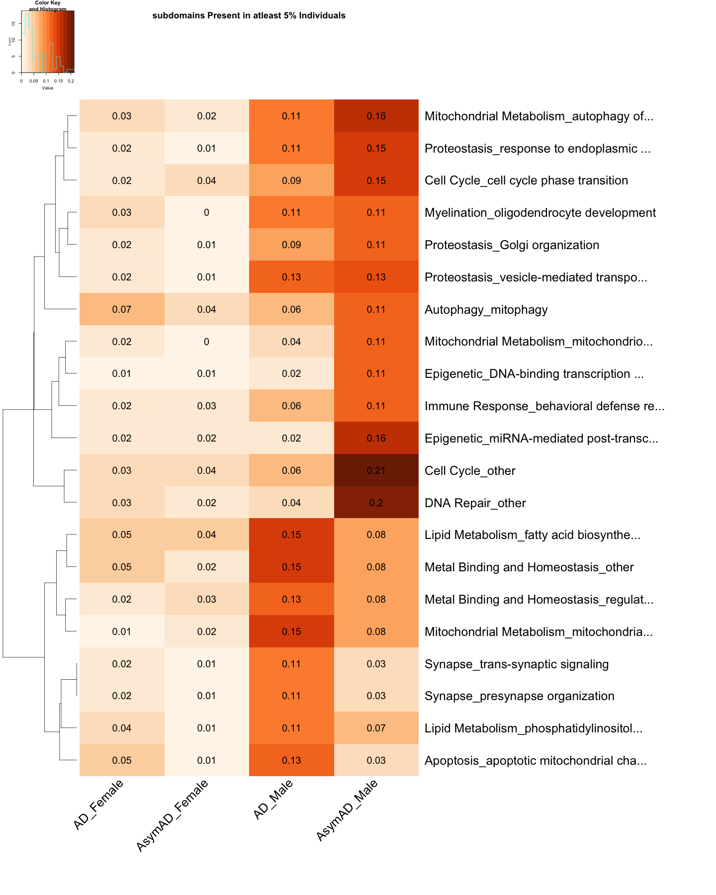
subset_data_subdomain_DOWN <- data_subdomain_new_DOWN %>% filter(DOWN_ratio_AD_female >= 0.10 | DOWN_ratio_AD_male >= 0.10 | DOWN_ratio_AsymAD_female >= 0.10 | DOWN_ratio_AsymAD_male >= 0.10)
rownames(subset_data_subdomain_UP) <- subset_data_subdomain_UP$Biodomain_Subdomain
rownames(subset_data_subdomain_DOWN) <- subset_data_subdomain_DOWN$Biodomain_Subdomain
subset_data_subdomain_UP <- subset_data_subdomain_UP[, -1]
subset_data_subdomain_DOWN <- subset_data_subdomain_DOWN[, -1]
# Replace NA values with 0 (or any other specific value)
subset_data_subdomain_UP[is.na(subset_data_subdomain_UP)] <- 0
subset_data_subdomain_DOWN[is.na(subset_data_subdomain_DOWN)] <- 0
head(subset_data_subdomain_UP, 3)
##                                          UP_ratio_AD_female UP_ratio_AD_male
## APP Metabolism_amyloid-beta clearance             0.1015625       0.08510638
## APP Metabolism_amyloid-beta formation             0.1875000       0.00000000
## APP Metabolism_amyloid precursor prot...          0.0000000       0.10638298
##                                          UP_ratio_AsymAD_female
## APP Metabolism_amyloid-beta clearance               0.050314465
## APP Metabolism_amyloid-beta formation               0.157232704
## APP Metabolism_amyloid precursor prot...            0.006289308
##                                          UP_ratio_AsymAD_male
## APP Metabolism_amyloid-beta clearance              0.04918033
## APP Metabolism_amyloid-beta formation              0.03278689
## APP Metabolism_amyloid precursor prot...           0.08196721
head(subset_data_subdomain_DOWN, 3)
##                                          DOWN_ratio_AD_female
## Apoptosis_apoptotic mitochondrial cha...            0.0546875
## Autophagy_mitophagy                                 0.0703125
## Cell Cycle_cell cycle phase transition              0.0234375
##                                          DOWN_ratio_AD_male
## Apoptosis_apoptotic mitochondrial cha...         0.12765957
## Autophagy_mitophagy                              0.06382979
## Cell Cycle_cell cycle phase transition           0.08510638
##                                          DOWN_ratio_AsymAD_female
## Apoptosis_apoptotic mitochondrial cha...               0.01257862
## Autophagy_mitophagy                                    0.03773585
## Cell Cycle_cell cycle phase transition                 0.03773585
##                                          DOWN_ratio_AsymAD_male
## Apoptosis_apoptotic mitochondrial cha...             0.03278689
## Autophagy_mitophagy                                  0.11475410
## Cell Cycle_cell cycle phase transition               0.14754098
# Reorder the columns
subset_data_subdomain_UP <- subset_data_subdomain_UP[, c(
  "UP_ratio_AD_female",
  "UP_ratio_AsymAD_female",
  "UP_ratio_AD_male",
  "UP_ratio_AsymAD_male"
)]

subset_data_subdomain_DOWN <- subset_data_subdomain_DOWN[, c(
  "DOWN_ratio_AD_female",
  "DOWN_ratio_AsymAD_female",
  "DOWN_ratio_AD_male",
  "DOWN_ratio_AsymAD_male"
)]


# Assign custom column names
colnames(subset_data_subdomain_UP) <- c("AD_Female", "AsymAD_Female", "AD_Male", "AsymAD_Male")

colnames(subset_data_subdomain_DOWN) <- c("AD_Female", "AsymAD_Female", "AD_Male", "AsymAD_Male")


# Create the heatmap with filtered row names
UP <- heatmap.2(
     as.matrix(subset_data_subdomain_UP),
     Rowv = TRUE,
     Colv = FALSE,
     col = color_scale3,
     scale = "none",
     trace = "none",
     margins = c(20, 50),
     key = TRUE,
     keysize = .50,
     cexCol = 2.5,
     srtCol = 45,
     cexRow = 2.5,
    cellnote=round(subset_data_subdomain_UP, 2),
    notecex=2,
    notecol="black",
    dendrogram = "row",
    main = "subdomains Present in atleast 5% Individuals"
)
# Create the heatmap with filtered row names
DOWN <- heatmap.2(
     as.matrix(subset_data_subdomain_DOWN),
     Rowv = TRUE,
     Colv = FALSE,
     col = color_scale6,
     scale = "none",
     trace = "none",
     margins = c(20, 50),
     key = TRUE,
     keysize = .50,
     cexCol = 2.5,
     srtCol = 45,
     cexRow = 2.5,
    cellnote=round(subset_data_subdomain_DOWN, 2),
    notecex=2,
    notecol="black",
    dendrogram = "row",
    main = "subdomains Present in atleast 5% Individuals"
)